Positive
Design, Brand Identity, Logo Design, Website Design, Advertisement, Lead Generation, Social Media Management,
Positive's mission is to connect every home and business in South Wales with the fastest internet possible and to do so they hired a team of creatives (myself included) to spread their message and reach a new type of audience.
We did this by creating the new brand identity, including an award winning logo, a new fully fleshed out website for both the residential and business side, lead generation campaigns and much more.
The Logo
I am very excited to say that the logo I co-created with Highly for Positive has been featured in this years edition of LogoLounge 14, selected from over 30,000 entires across the world - not bad for my very first officially recognised logo since graduating university!
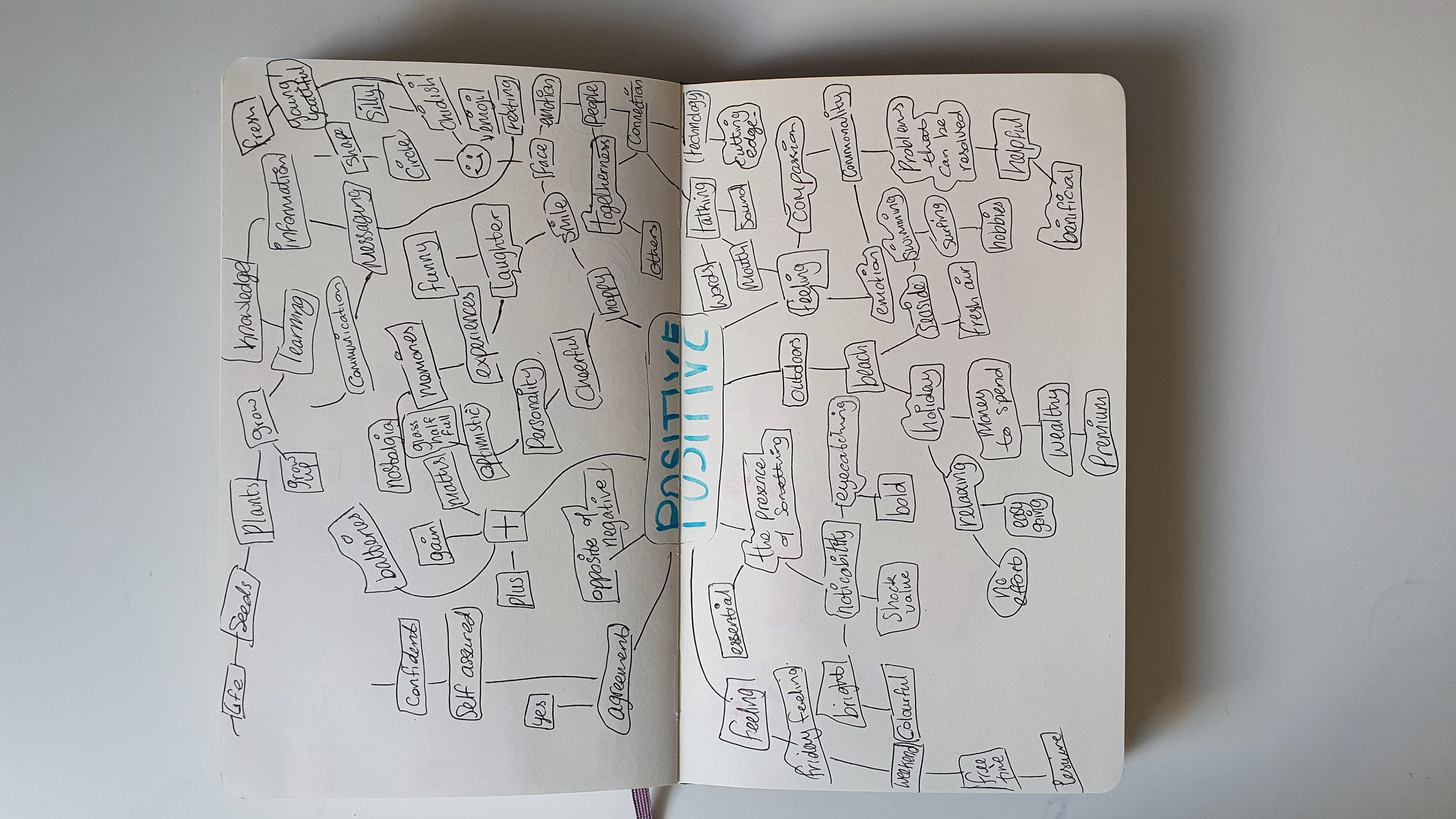
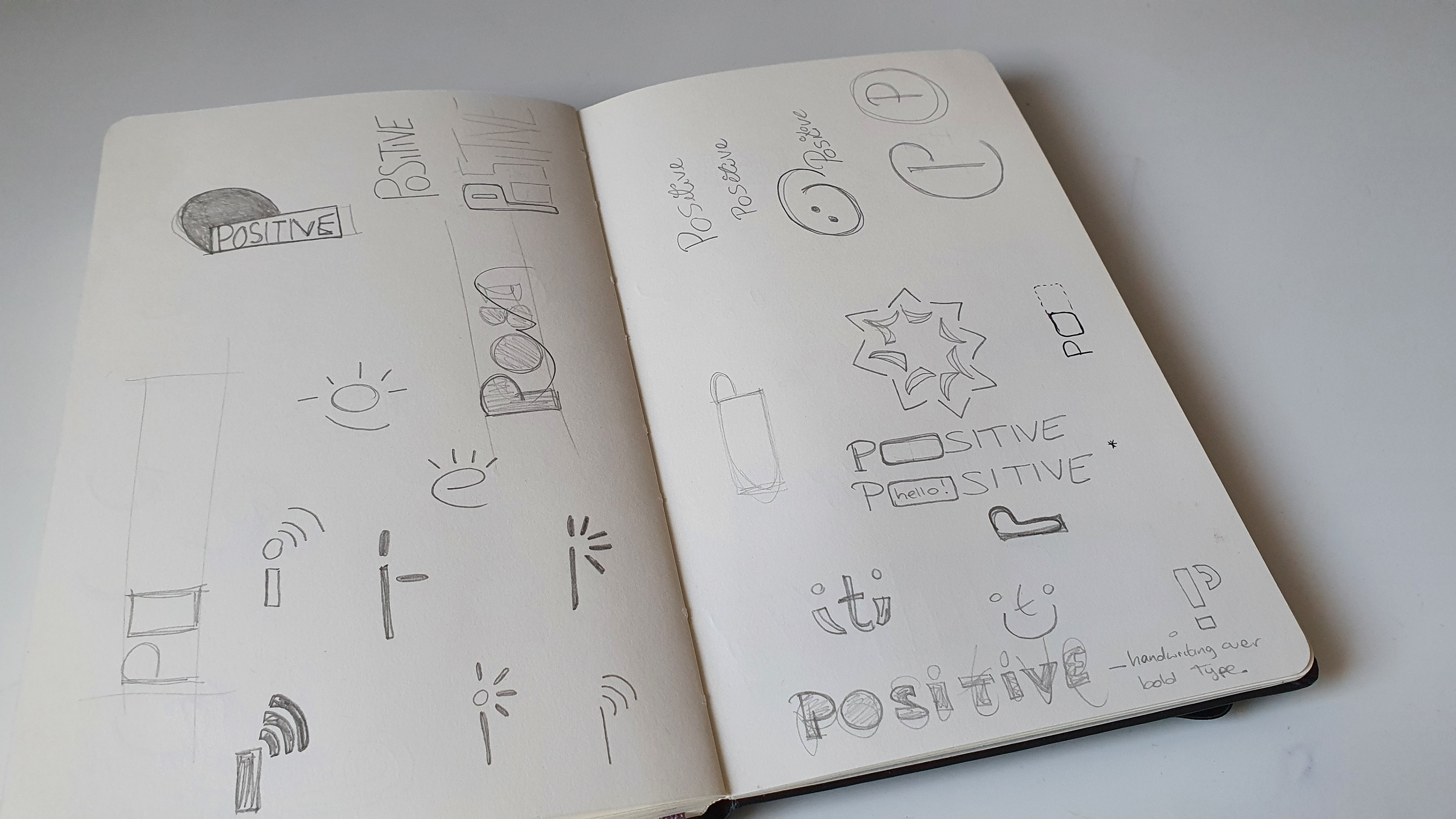
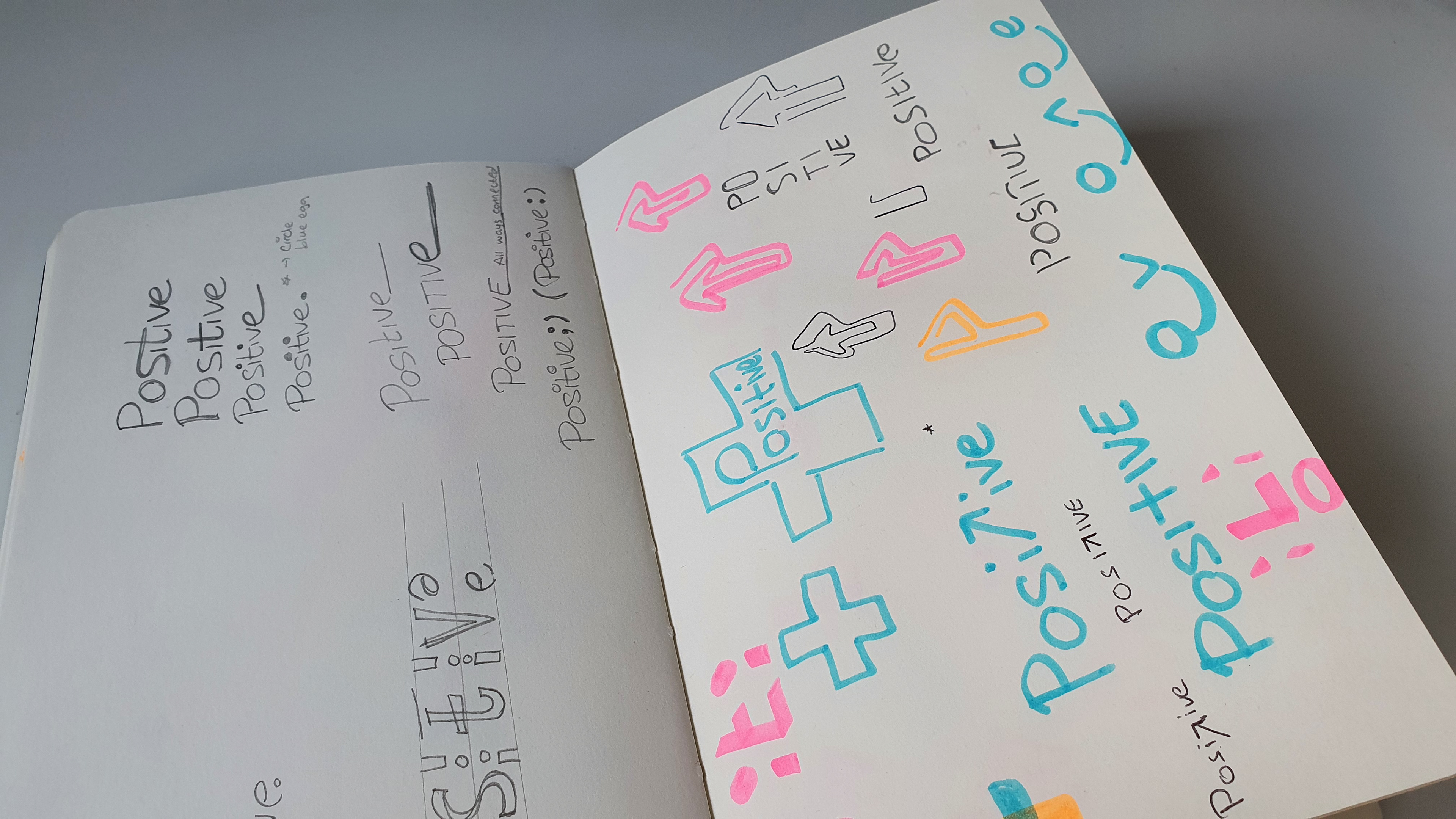
Fun fact: I filled out 1 entire Moleskine sketchbook (roughly 500 sketches) when sketching out the concepts for this logo. I wanted to get it just right!
Positive full logo
Positive 'Squircle' icon
Positive's logo & icon aligns with the brand values of being 'cheeky' and 'not too serious' with the smiley 'Squircle' yet maintains their reliability with the custom made lettering which was created using the Fibonacci sequence and a series of precise measurements to accurately space out the letters. The icon is bold and distinctive enough to be used on it's own and can be seen clearly even at favicon size.
Colour Palette
The Squircles
In order to really tell Positive apart from all of the other telecoms brands who tend to take on a more corporate feel, I created a visual identity using ’Squircles’, little characters to represent the brand in a friendly and approachable way to the consumer market.
Meet The Squircles
From looking into the competition, I noticed a trend where IT and telecommunication brands tended to be very corporate, use jargon and dull graphics, if any at all which was confusing and misaligned to Positive's values.
That's me on the right, aka the 'Viz Wiz'.
Most of the characters are based on the staff at Positive or of the customers. The main Squircle, ‘Mr Positive’ was based off the head of the company Jason, who was commonly referred to as such.
Van Redesign
The Positive van, before (left) & after (right)
The Website
The website was completely remade from scratch using Wordpress and developed as necessary when we created new campaigns, added new services etc.
The site is divided into 2 main pages, one for the B2C customers and one for B2B with a slightly different style to differentiate the 2 sides of the business but still keeping with the brand identity and style so you know it’s still Positive’s site.
Referral Scheme
To collect email addresses and gain more customers we created a referral system. When existing customers filled out the form and referred friends they would be able to save money on their monthly contacts.
Printed Material
Welcome Booklet
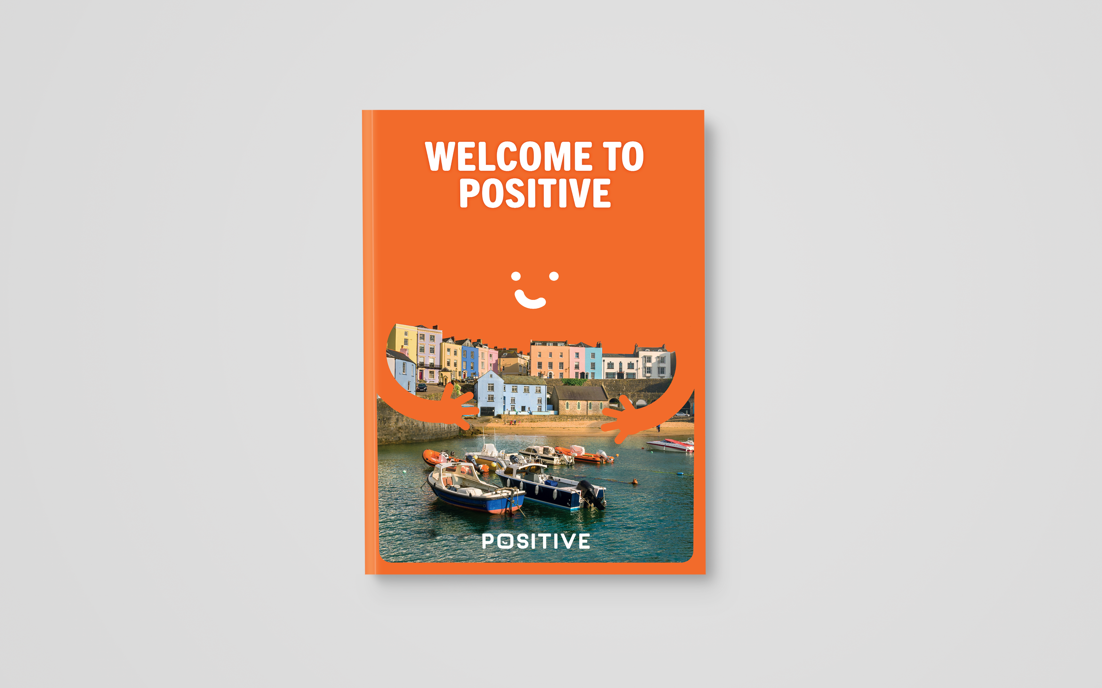

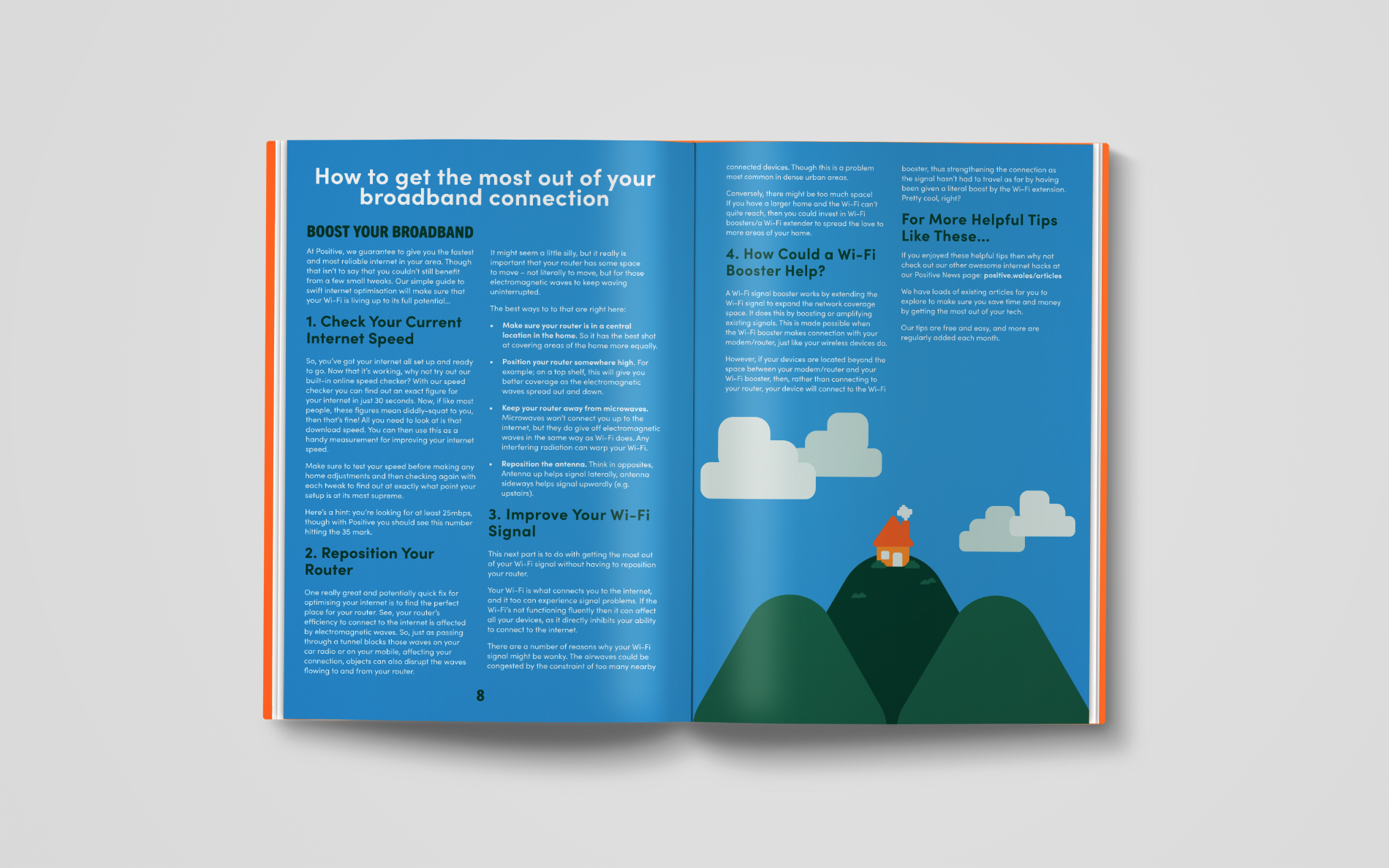
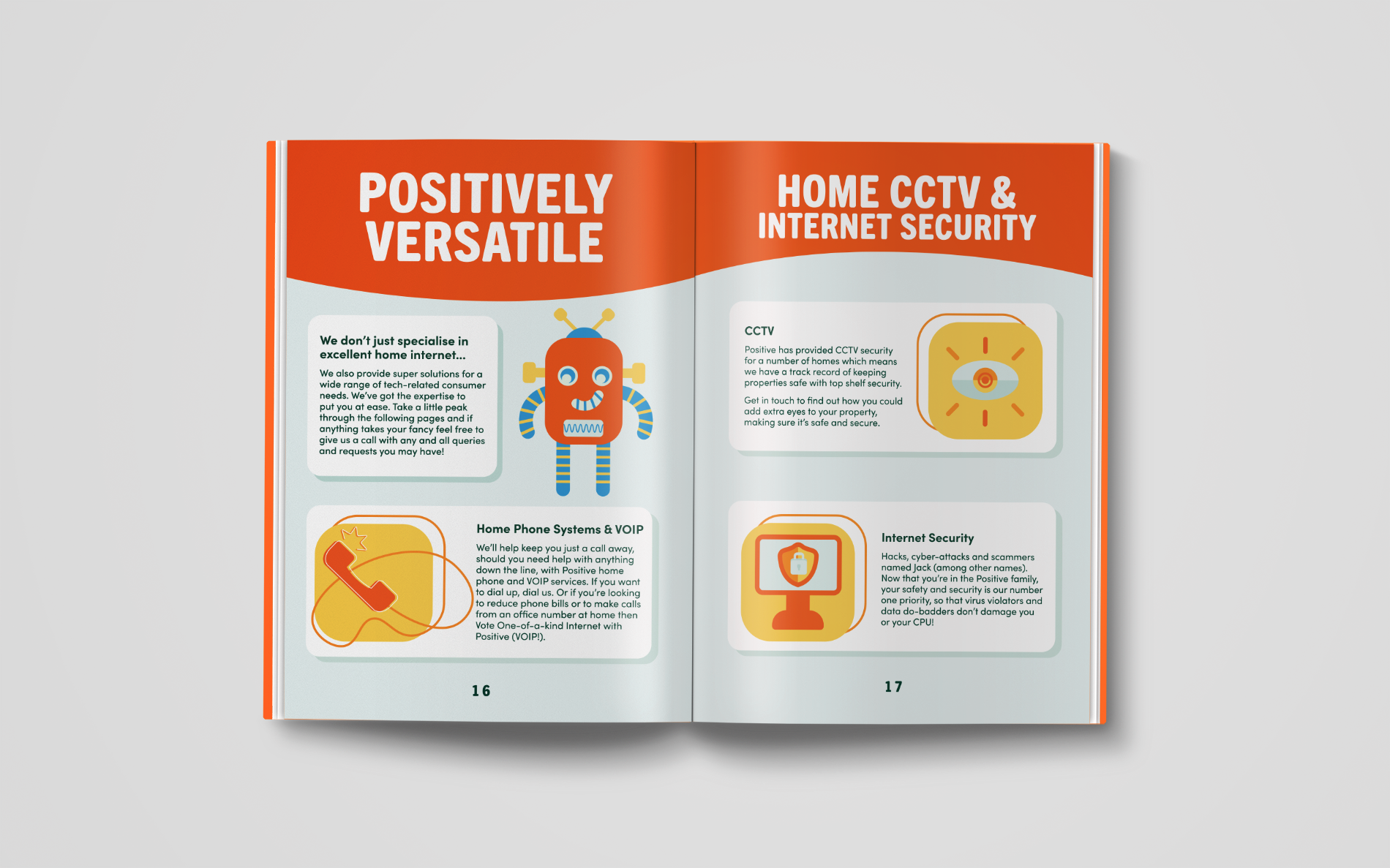

For new customers joining Positive, we wanted to give them a little something as a thank you and as extra information and to advertise our other services offered by Positive for both residential and business customers.
Social Media Management
A big part of my role was to be the face of the company on social media with the main goal being maintaining a online presence. Regularly posting and shaping the personality of the brand in a 'not so serious' way.
Uniform
For Positives uniform, I decided on 2 colour-ways. The orange uniform would be for the office workers and dark green for the installers. Not only was this a good way to represent both sides of the brand effectively but it also meant that any marks and dust from completing installation tasks would be less visible on the dark green.
Animated Advertisement
Animated advertisement story board sketches
To promote the Positive band to a wider audience online, I decided to create an animated advertisement implementing all of the branding elements constructed for the rebrand.